Project Overview
GGLS AI Kiosk__
Index
case-study
product-design
Information
case-study
product-design
Contribution
UIUX Design, Product Design
Team
Kyuchan Lee, GoodGang-Labs Company
Timeline
6 Months / 2024-25
Tools


Tags
case-study
product-design
Type
full-time
ai-design
uiux-design
product-design
Project Overview
GGLS AI Kiosk__
Index
case-study
product-design
Information
case-study
product-design
Contribution
UIUX Design, Product Design
Team
Kyuchan Lee, GoodGang-Labs Company
Timeline
6 Months / 2024-25
Tools


Tags
case-study
product-design
Type
full-time
ai-design
uiux-design
product-design


Overview
Overview
Overview
● High-Level Summary - Overview
I Worked With GoodGang-Labs to Turn a Set of Loosely Defined Ideas Into a Cohesive, Usable Product Interface and Experience.
The Goal Was to Create a Voice-Operated AI-Checkout Kiosk that can Eventually Replace the Duties of In-Store Staff, Ultimately Reducing the Operating Cost of Running an In-Person Store.
I Worked With GoodGang-Labs to Turn a Set of Loosely Defined Ideas Into a Cohesive, Usable Product Interface and Experience.
The Goal Was to Create a Voice-Operated AI-Checkout Kiosk that can Eventually Replace the Duties of In-Store Staff, Ultimately Reducing the Operating Cost of Running an In-Person Store.
● Impact - Overview
● Impact - Overview
Within 6 Months, We Turned a Concept Into a Real Usable Product, Shipped a Total of Three Iterations in Korea, and Secured Three Retail Partners.
We used Korea as a test bed not because it was convenient, but because it’s one of the most demanding places to prove a commerce experience. People are highly accustomed to fast, efficient service, they already have strong expectations for kiosks, and they won’t tolerate friction for novelty alone.
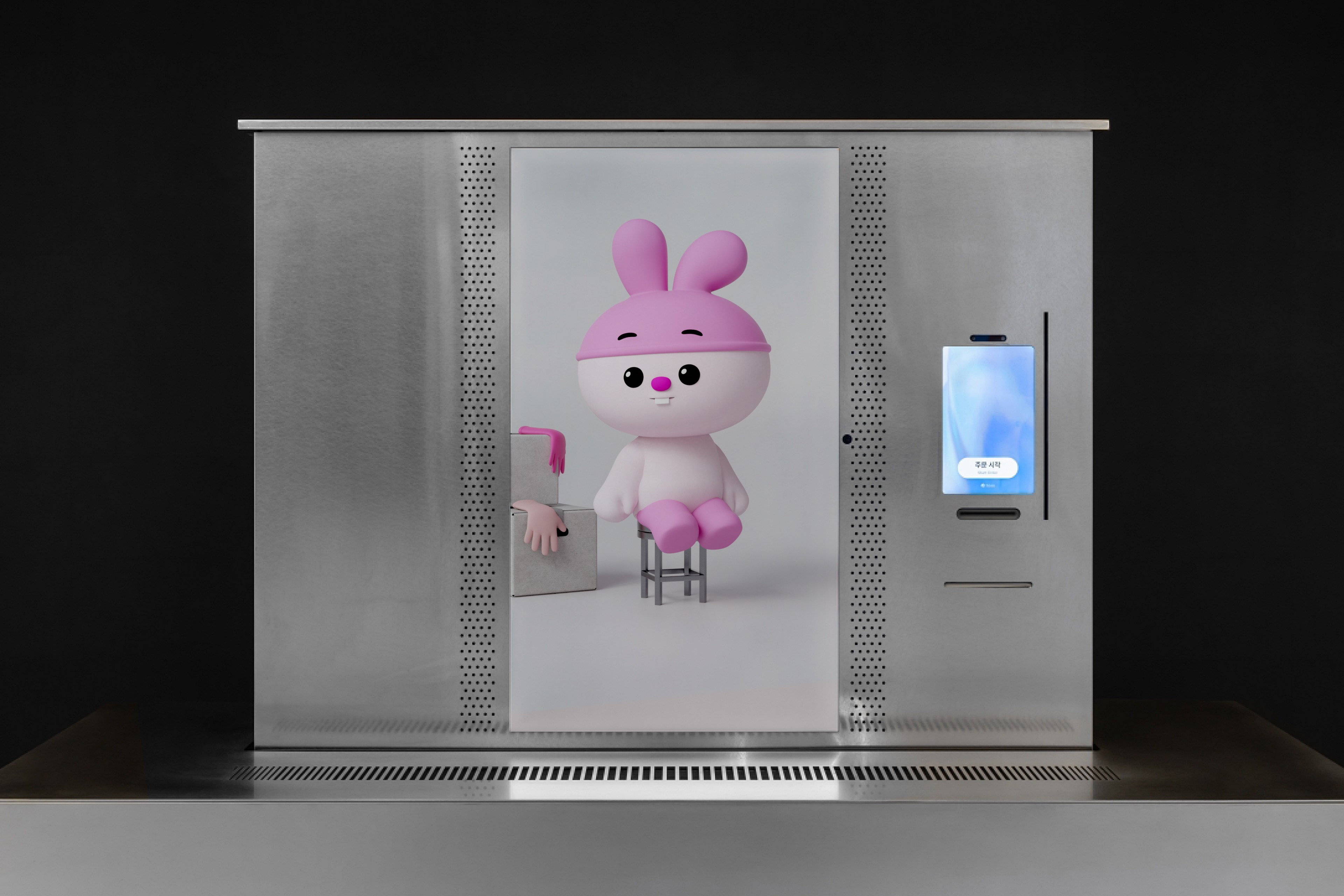
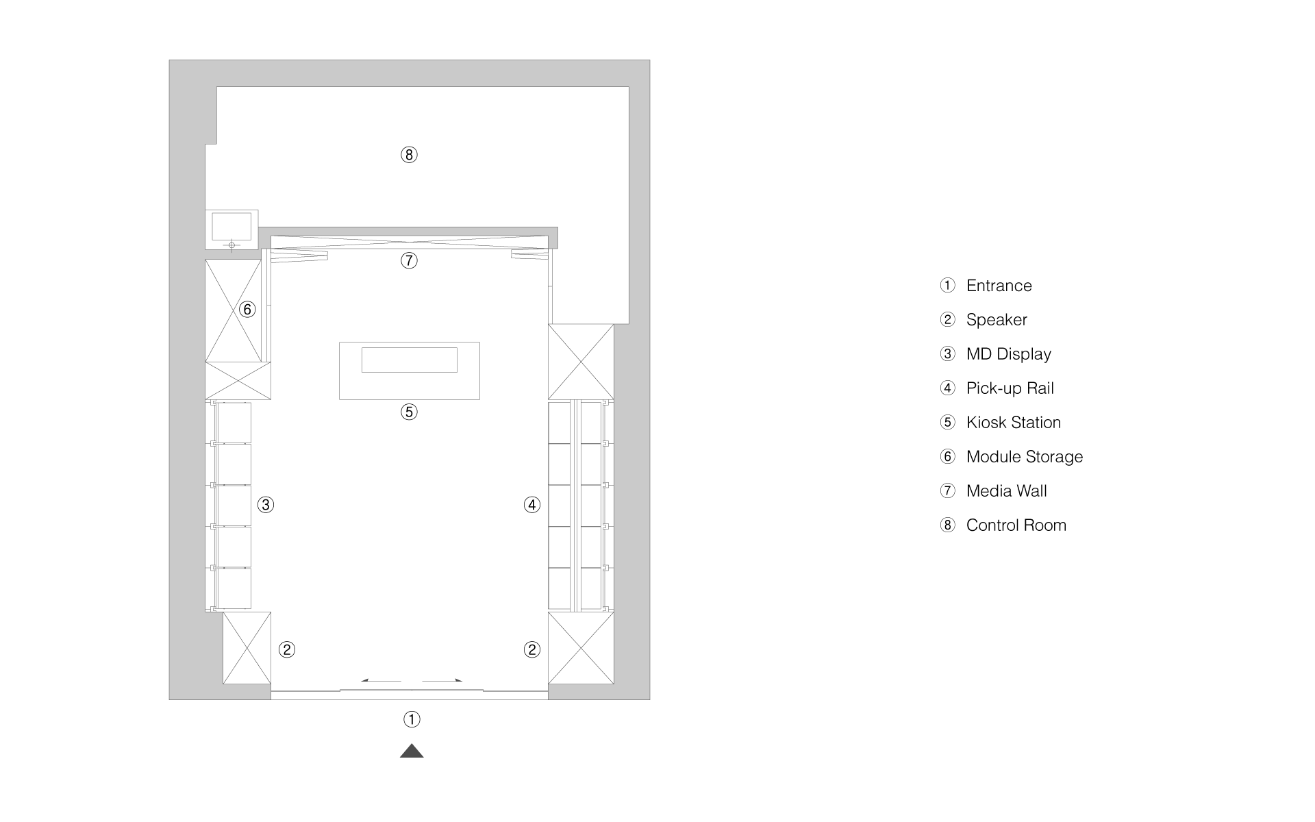
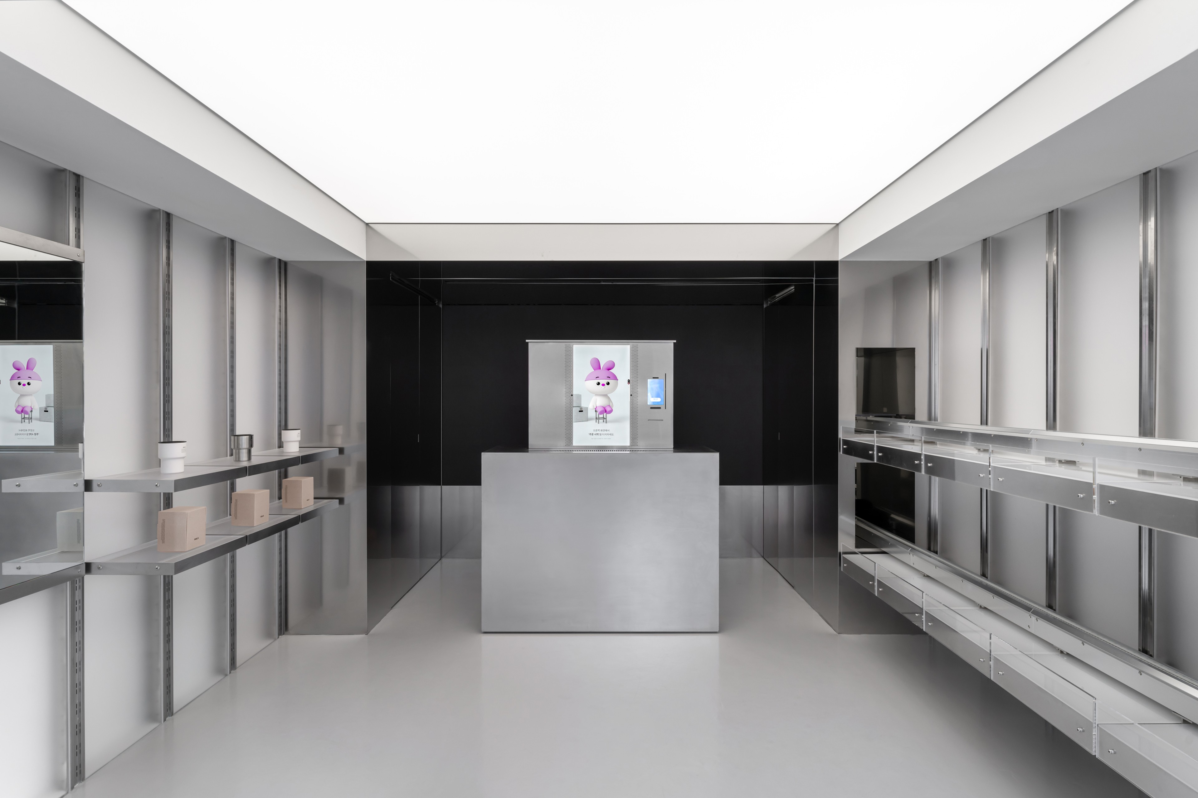
GGLS' Kiosk & Offline Flagship Store Located in Seoul, Sinsa


Getting Started
Getting Started
● Approach Summary - Getting Started
For a Product This New, We Decided to Aggressively Ship to Learn. We Built an MVP, Observed How People Used It, and Iterated From Real Insights than Assumptions.
● MVP Impact - Getting Started
Shipping of the MVP Served as a Crucial Anchor Point, Revealing Core Pain-Points that Allowed for a Comprehensive Diagnosis of Our Product.
With the ambiguous nature of our product, our team decided to aggressively build, ship and test to quickly validate feasibility of concepts. We conducted guerrilla testings with potential clients, partnerships, groups of college students, available walk in customers, and friends.
● MVP Core Pain-Points - Getting Started
MVP Diagnosis; The MVP Revealed that the Kiosk had a Steep Learning Curve, but Lacked the Crucial Information and Guidance Needed for Success.
Pain-Point 01
Pain-Point 01
When to Speak Wasn't Clear;
The Turn-Taking Conversation System Wasn't Self Explanatory Enough, so Users Spoke Over the AI-Agent or Hesitated at Wrong Moments.
When to Speak Wasn't Clear;
The Turn-Taking Conversation System Wasn't Self Explanatory Enough, so Users Spoke Over the AI-Agent or Hesitated at Wrong Moments.
Only a small number of users had successful ordering experiences without staff guidance, majority of users suffered from cascading failures.
(ex: *Missed STT > Confusion > Retries > Repeat)
Only a small number of users had successful ordering experiences without staff guidance, majority of users suffered from cascading failures.
(ex: *Missed STT > Confusion > Retries > Repeat)
Pain-Point 02
Pain-Point 02
How to Operate Wasn't Clear;
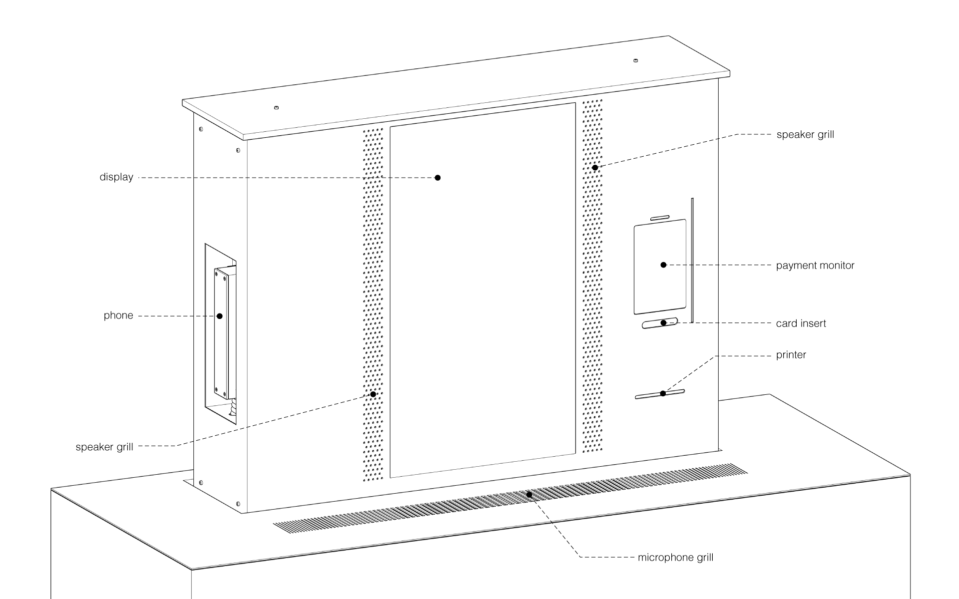
Sessions had to be Started Through a Touch-Screen Payment Device on the Side, And the Kiosk's Voice-Only Operation Wasn't Self Evident.
How to Operate Wasn't Clear;
Sessions had to be Started Through a Touch-Screen Payment Device on the Side, And the Kiosk's Voice-Only Operation Wasn't Self Evident.
Users always experienced initial friction trying to find out the kiosk's operation method, which resulted in initial distrust and hesitation.
Pain-Point 03
Pain-Point 03
What to Say Wasn't Clear;
Phrasing Requirements for Successful Orders Weren't Communicated, so Users Spoke in Fragments or Varied Styles.
What to Say Wasn't Clear;
Phrasing Requirements for Successful Orders Weren't Communicated, so Users Spoke in Fragments or Varied Styles.
In order for the LLM/SLM AI-agent to accurately interpret user's requests, the orders had to fulfill specific requirements such as quantity, color, name, size.
(ex: *I want to order "One"—"Silver"—"Medium Size"—"Tumbler")
In order for the LLM/SLM AI-agent to accurately interpret user's requests, the orders had to fulfill specific requirements such as quantity, color, name, size.
(ex: *I want to order "One"—"Silver"—"Medium Size"—"Tumbler")
Pain-Point 04
Pain-Point 04
Mismatch in Expectations;
Users Expected Efficient Transactional Interactions Rather than a Back & Forth Interaction with the AI-Agent.
Mismatch in Expectations;
Users Expected Efficient Transactional Interactions Rather than a Back & Forth Interaction with the AI-Agent.
Users processed dialogues before the AI-agent even finished speaking, and often felt the dialogues were too long. Users were focused on getting to the payment as soon as possible rather than conversations.
Frame and Solve
Frame and Solve
● How Might We… - Frame and Solve
With the Diagnosis, What We had to Solve Became Clearer.
"How Might We Make a Voice-Operated Checkout Kiosk Instantly Learnable, So Users Know When-to-Speak, What-to-Say, and How-to-Operate the Kiosk All On Their Own?"
With the Diagnosis, What We had to Solve Became Clearer.
"How Might We Make a Voice-Operated Checkout Kiosk Instantly Learnable, So Users Know When-to-Speak, What-to-Say, and How-to-Operate the Kiosk All On Their Own?"
● In-Person Store Insights - Frame and Solve
I Studied How People Shop In-Person, Extracting Insights to Apply to Our AI-Kiosk Experiences.
Insight 01
Insight 01
There were Two Types of Store Checkout Experiences,
Streamlined-Purchase vs Consultative-Purchase.
There were Two Types of Store Checkout Experiences,
Streamlined-Purchase vs Consultative-Purchase.
In real stores, most customers arrived with one of two intents. Some were already decided and wanted a streamlined purchase, while others were undecided and need consultation.
(ex: *convenience stores vs shoe stores)
In real stores, most customers arrived with one of two intents. Some were already decided and wanted a streamlined purchase, while others were undecided and need consultation.
(ex: *convenience stores vs shoe stores)
Insight 02
Insight 02
Helpful Staffs Led Customers Through the Checkout Process with Clear and Easy Questions.
Efficient staffs asked customers specific questions rather than open-ended questions, making it easy for customers to respond.
(ex: *“What do you need?” vs “What can I help you purchase?")
Efficient staffs asked customers specific questions rather than open-ended questions, making it easy for customers to respond.
(ex: *“What do you need?” vs “What can I help you purchase?")
● AI-Product Insights - Frame and Solve
I Studied AI Voice-Products and Conversational Interfaces from Leading AI Companies.
Insight 01
Insight 01
Voice-Experiences Progress Using Dialogues Rather than Screens, Shifting the UI’s Purpose Into Bringing Clarity to the System’s Status.
Leading voice-experiences kept a minimal UI design because they don’t have “pages” to navigate, the user-flow is replaced by the conversation.
So the visuals aren’t for navigating, they’re for clarity; showing users what’s happening, what was heard, and what to do next.
Leading voice-experiences kept a minimal UI design because they don’t have “pages” to navigate, the user-flow is replaced by the conversation.
So the visuals aren’t for navigating, they’re for clarity; showing users what’s happening, what was heard, and what to do next.
Insight 02
Insight 02
Voice-Experiences Optimized Converting Conversations Into Solving Needs, Not Having a Conversation.
In voice-interactions especially, users feel friction when the conversation feels like a long back-and-forth.
Users have a clear need, and want the system to understand quickly, respond briefly, and move them to completion.

In voice-interactions especially, users feel friction when the conversation feels like a long back-and-forth.
Users have a clear need, and want the system to understand quickly, respond briefly, and move them to completion.








The Design; 0 to 1
The Design; 0 to 1
The Design; 0 to 1
● 1st Design Iteration - 0 to 1
Based on Prior Insights, We Shipped a Single-Screen Interface that Prioritized System and Information Clarity Throughout the Kiosk’s Conversation-Driven Flow.
We tested this version of the product through partnerning with Mamison in the form of a pop-up retail. This was our official launch of the store & kiosk, and I observed and documented over 1700+ live sessions and collected 175+ exit surveys from users, while collecting live feedback for the next iterations.

Core-Interaction 01
Core-Interaction 01
Standby Screen;
Guidance in How to Initiate Session.
Standby Screen;
Guidance in How to Initiate Session.
Due to technical limitations, the order session had to be initiated through a smaller adjacent payment screen on the right side of the kiosk.


Core-Interaction 01
Core-Interaction 01
Turn-Taking in Action;
When to Wait vs When to Speak Your Order.
Turn-Taking in Action;
When to Wait vs When to Speak Your Order.
A short demo of the conversation-interaction, showcasing how the kiosk switches between AI speaking and user-input
Core-Interaction 02
Core-Interaction 02
Order Summary;
Reviewing and Finalizing Your Order.
Order Summary;
Reviewing and Finalizing Your Order.
The kiosk consolidates the order into a final review screen, helping users verify items before moving to payment.


Core-Interaction 03
Core-Interaction 03
Payment and Pickup Guidance;
What Happens After Order Summary.
Payment and Pickup Guidance;
What Happens After Order Summary.
Post-checkout guidance directs users through payment and clearly communicates where and how to pick up their items.
Design Solution 01
Design Solution 01
A Single-Screen Layout to Keep Users Focused.
The MVP’s separate catalog screen created an attention split, which resulted in missed speaking cues, snow-balling into cascading failures.
In this iteration, I eliminated the need to scan multiple surfaces by designing a single screen layout that includes everything the user needs for ordering.
The MVP’s separate catalog screen created an attention split, which resulted in missed speaking cues, snow-balling into cascading failures.
In this iteration, I eliminated the need to scan multiple surfaces by designing a single screen layout that includes everything the user needs for ordering.

Design Solution 02
Turn-Indicators that Make "Wait" vs "Speak" Clear.
In this iteration, I visually differentiated the user's turn and the ai-agent's turn, while also using clear text labels to remove any ambiguity

Design Solution 03
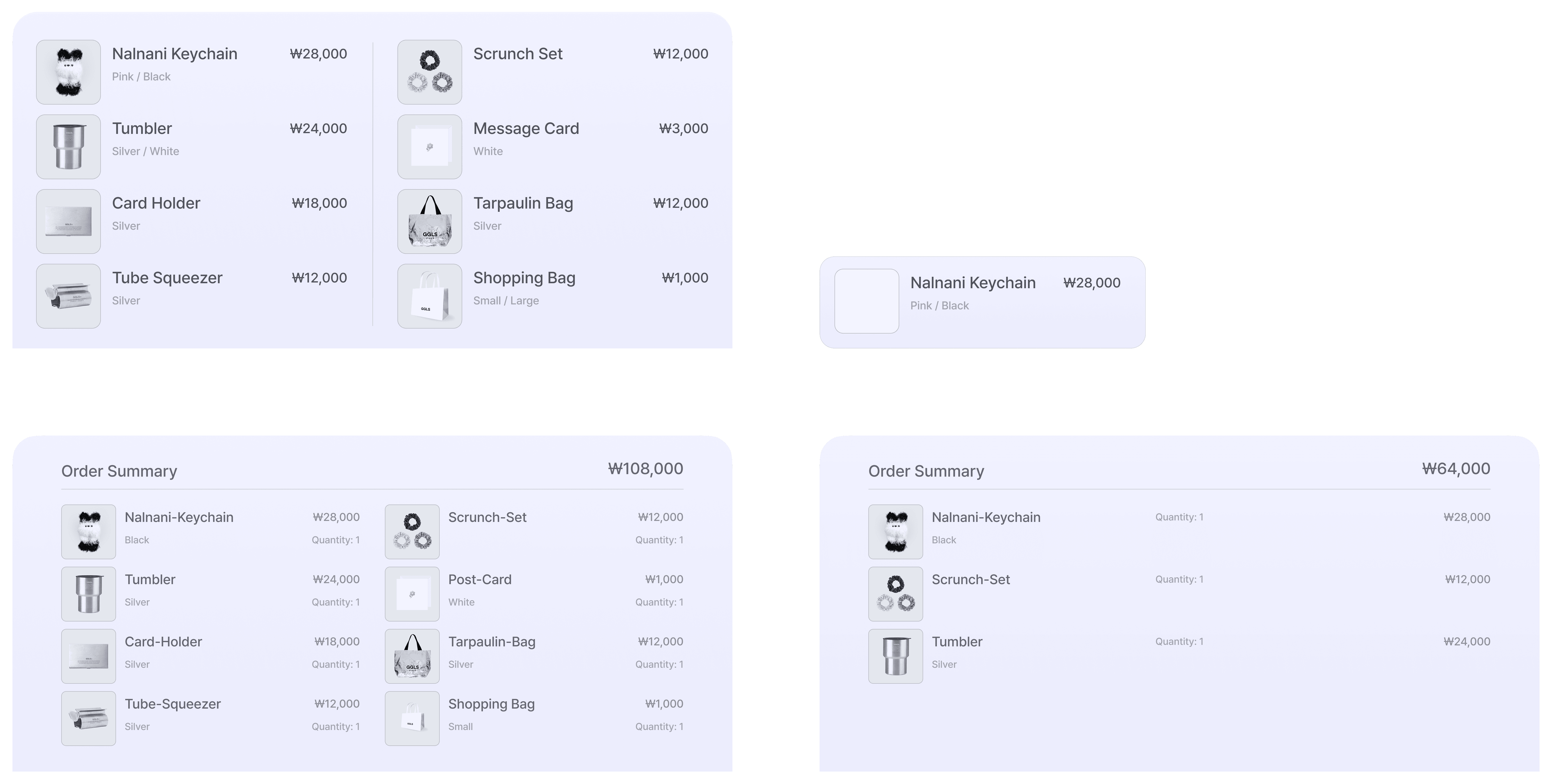
A Dual Purpose Catalog, See What You Can Order, and Finalize What You Ordered.
In this iteration, I integrated a two-purpose catalog so users can reference exact product names while speaking, then confidently finalize their purchase through the order summary screen

Design Solution 05
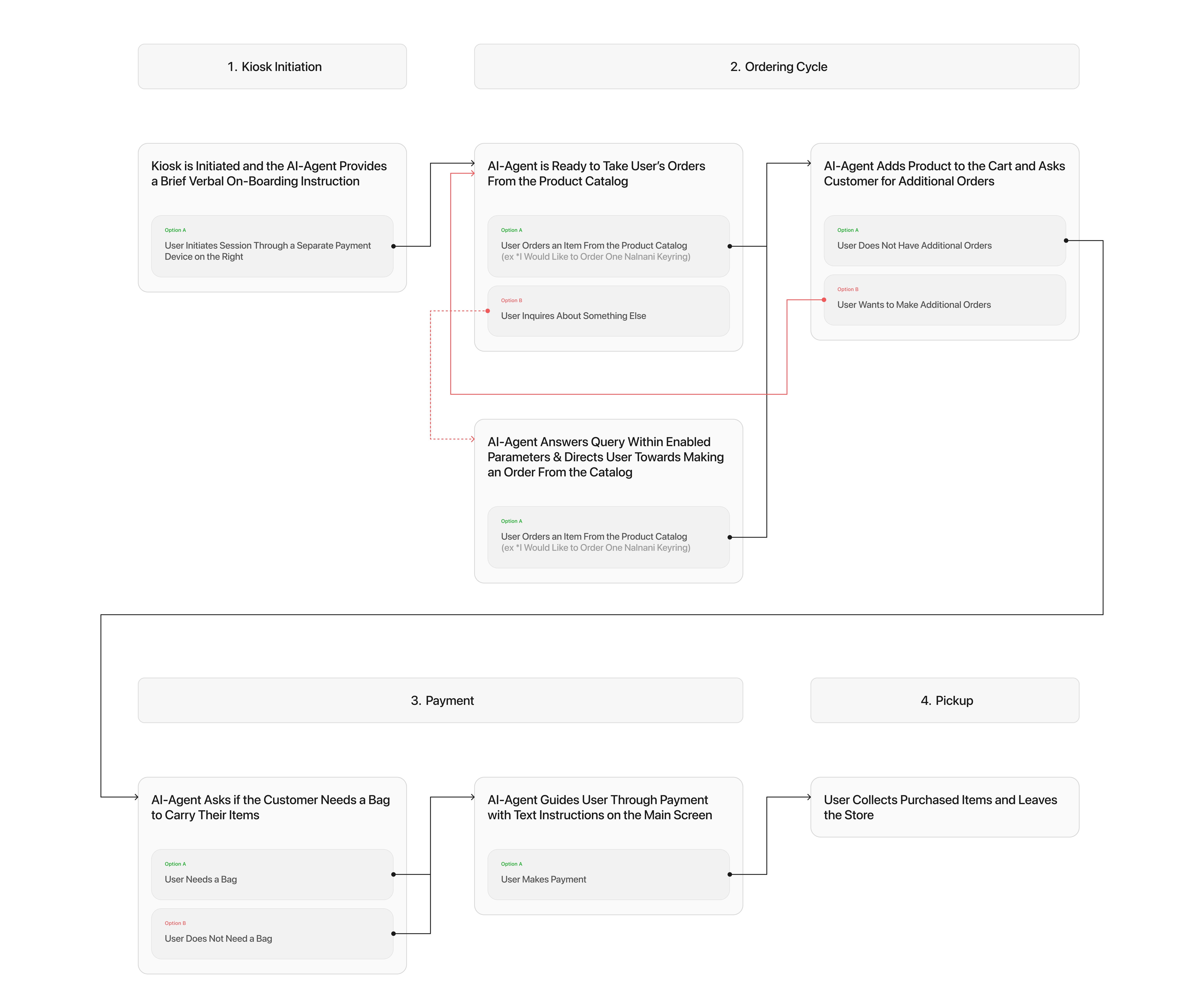
The Conversation-Driven End-to-End Kiosk User Flow.
Voice-UIs don't navigate through the user flow like most traditional interfaces, instead the end-to-end flow is carried by the conversation.

● 1st Iteration Summary - 0 to 1
The First Iteration Made the Kiosk Learnable, But Real Usage Exposed the Need to Optimize Each Component and Its Interactions to Drive a Successful Voice Experience.
● 1st Iteration Core Pain-Points - 0 to 1
First Iteration Diagnosis; The Problem Evolved from Providing Users with Crucial Guidance, To Optimizing a Real-Time UI Interaction.
Pain-Point 01
Pain-Point 01
The Turn-Indicator's Status Changes Were Too Subtle to Catch During Active Conversations.
= When to Speak Wasn't Clear
The Turn-Indicator's Status Changes Were Too Subtle to Catch During Active Conversations
= When to Speak Wasn't Clear
State changes didn’t stand out quickly enough, so users missed their speaking window even when they understood the idea of turn-taking.
Pain-Point 02
Pain-Point 02
The New UI Elements Looked Tappable, Which Reinforced Touch-Based Interactions.
= How to Operate Wasn't Clear
The New UI Elements Looked Tappable, Which Reinforced Touch-Based Interactions.
= How to Operate Wasn't Clear
The catalog and turn area read as buttons, so users defaulted to tapping—despite the kiosk being voice-led.
Pain-Point 03
Pain-Point 03
The Catalog Functioned as a Menu, Not a Prompt Guide, It Lacked Clear Instructions Needed to Help Users Phrase Their Orders Correctly.
= What to Say Wasn't Clear
The Catalog Functioned as a Menu, Not a Prompt Guide, It Lacked Clear Instructions Needed to Help Users Phrase Their Orders Correctly.
= What to Say Wasn't Clear
Users could see product names, but the UI didn’t help them translate that information into successful order sentences.
● 2nd Design Iteration - 0 to 1
We Refined the Kiosk Into a More "Guided Ordering Experience", By Strengthening Its Visual Clarity and Adding Guidance Features to Carry the User From Start to Finish.
In our second collaboration, we partnered with 78-Under in the form of a long-term retail to launch their next product series at our store. We had reworked a significant chunk of our product ranging from the visual interface & user-flows to major technical architectures, yielding improved usability results.
Core-Interaction 01
Core-Interaction 01
78 Under Collab Standby Screen;
Guidance in How to Initiate Session.
78 Under Collab Standby Screen;
Guidance in How to Initiate Session.
Due to technical limitations, the order session had to be initiated through a smaller adjacent payment screen on the right side of the kiosk.


Core-Interaction 01
Core-Interaction 01
The On-Boarding User-Flow;
Guiding Users When to Wait vs When to Speak.
The On-Boarding User-Flow;
Guiding Users When to Wait vs When to Speak.
Despite its downsides, we added an on-boarding flow to the start of each session to enhance usability in the longterm.
Core-Interaction 02
Core-Interaction 02
Simplified Menu and Ordering Prompt Tips.
We simplified the menu and added prompt examples to guide users when voice prompting their orders.


Core-Interaction 03
Core-Interaction 03
Order Confirmation;
Visualizing to See What You've Ordered.
Order Confirmation;
Visualizing to See What You've Ordered.
The kiosk consolidates the order into a final review screen, helping users verify items before moving to payment.
Core-Interaction 04
Core-Interaction 04
Payment and Pickup Guidance;
What Happens After Checkout Summary.
Payment and Pickup Guidance;
What Happens After Checkout Summary.
We simplified the menu and added prompt examples to guide users when voice prompting their orders.

Design Solution 01
Design Solution 01
Polished Screen Hierarchy with Additional Guiding Features; On-Boarding, Order Prompt Examples, Visualized Order Selections
The MVP’s separate catalog screen created an attention split, which resulted in missed speaking cues, snow-balling into cascading failures.
In this iteration, I eliminated the need to scan multiple surfaces by designing a single screen layout that includes everything the user needs for ordering.
The MVP’s separate catalog screen created an attention split, which resulted in missed speaking cues, snow-balling into cascading failures.
In this iteration, I eliminated the need to scan multiple surfaces by designing a single screen layout that includes everything the user needs for ordering.

Design Solution 02
Design Solution 02
Turn Indicators with Clear Color Differentiation and Minimal Design to Solve Confusion and Comprehension Between "Wait" vs "Speak"
In this iteration, I visually differentiated the user's turn and the ai-agent's turn, while also using clear text labels to remove any ambiguity

Design Solution 03
Design Solution 03
A Multipurpose Catalog, Expanding Into Various Guidance Screens; On-Boarding, Order Prompt Examples, Visualized Order Selections, and Checkout
In this iteration, I integrated a two-purpose catalog so users can reference exact product names while speaking, then confidently finalize their purchase through the order summary screen

Design Solution 05
Design Solution 05
The Conversation-Driven End-to-End Kiosk User Flow; Expansion to Consultative Responses
Voice-UIs don't navigate through the user flow like most traditional interfaces, instead the end-to-end flow is carried by the conversation.

Handoff
Handoff
Handoff
● Take Aways
● Take Aways
Retrospecting and Takeaways
Lorem ipsum odor amet, consectetuer adipiscing elit. Proin tempus enim adipiscing ut netus id. Libero tortor suscipit vel ridiculus tellus molestie efficitur. Tristique sagittis sodales sollicitudin amet. Pulvinar mi sollicitudin nec sagittis. Mollis tempor quam finibus montes. Condimentum nulla pellentesque neque ornare.
Lesson 01
Experiencing The Rigorous 0 to 1
Lorem ipsum odor amet, consectetuer adipiscing elit. Proin tempus enim adipiscing ut netus id. Libero tortor suscipit vel ridiculus tellus molestie efficitur. Tristique sagittis sodales sollicitudin amet. Pulvinar mi sollicitudin nec sagittis. Mollis tempor quam finibus montes. Condimentum nulla pellentesque neque ornare.
Lesson 02
Importance In Continuous Communication and Alignment
Lorem ipsum odor amet, consectetuer adipiscing elit. Proin tempus enim adipiscing ut netus id. Libero tortor suscipit vel ridiculus tellus molestie efficitur. Tristique sagittis sodales sollicitudin amet. Pulvinar mi sollicitudin nec sagittis. Mollis tempor quam finibus montes. Condimentum nulla pellentesque neque ornare.
This is a part of the many things I worked on, I’m happy to chat more about my process & work over a call.